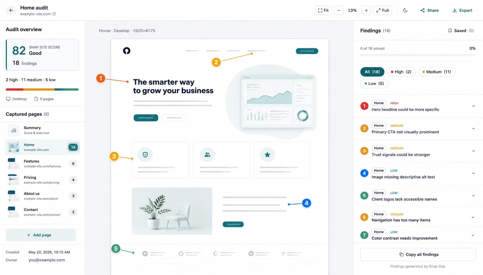
Before you redesign anything, spend an hour auditing what's already there. Not because the current homepage deserves saving — maybe it doesn't — but because a redesign that starts without evidence usually ships the same problems in a nicer wrapper. This is the checklist we use for that hour.
One thing before you start: audit the live page, not the design file. The live version has the cookie banner, the promo bar someone added in March, the A/B variant half your visitors see. That's the page people actually meet, and it's usually where the problems are.
1. The five-second read
Look at the first screen — just what's visible before scrolling — and try to answer three questions as if you'd never seen the product. What is this? Who's it for? What am I supposed to do?
If you can't answer all three, stop. That's your first high-severity finding, and it might be the whole redesign brief.
A few specific things to check:
- Does the headline say what the product does, or is it a slogan that could sit on any SaaS homepage?
- Is there one clear primary button, and does its label tell you what happens when you click it?
- Is there a real screenshot of the product anywhere on that first screen?
The failure we see most often: the headline is a vibe ("Work smarter"), the subhead restates the vibe, and the only place the page admits what the product actually is... is the nav. If your navigation is doing a better job than your hero, write that down.
2. Hierarchy
Zoom out to 50% and squint. Whatever still stands out is what the page is actually saying — and that should be the headline, the primary action, and your proof. Not the partner logo strip. Not the animated blob.
Count the calls to action while you're at it. Homepages collect CTAs over time — Start free, Book a demo, Watch the video, Talk to sales. Each one made sense to someone at some point. Together they cancel each other out. Pick the one that matters for a first-time visitor and let the rest go quiet.
3. Navigation
Read every nav label out loud and ask whether a stranger could guess what's behind it. "Platform", "Solutions", and "Resources" tell people nothing. They survive because everyone inside the company knows what they mean.
Check the footer too. It's where people go when the page has failed them, so pricing, contact, and legal links should be reliably there.
4. Trust, placed where the doubt is
Testimonials, logos, security notes, usage numbers — these work when they sit next to the question they answer. A quote about easy onboarding belongs beside the signup button, not in a wall of praise three screens down.
Walk the page and mark every point where a visitor has to decide something: click, keep scrolling, hand over an email. Then check whether there's any reassurance at that exact spot. Usually there isn't.
And be honest about whether your proof would convince you. Round numbers with no source and testimonials with no name attached can do more harm than showing nothing.
5. Accessibility basics
You don't need a full WCAG review at this stage, but you should catch the obvious usability issues that lock people out:
- Contrast — light gray body text on white, and any text sitting on a hero image.
- Text baked into images — screen readers can't read it, translators can't translate it, and it blurs on small screens.
- Clickability — can you tell what's a link or a button without hovering?
- Focus — tab through the first screen. If you can't see where you are, keyboard users can't either.
- Motion — anything that auto-plays or auto-rotates deserves a second look.
Flag these now, while they can still become requirements for the redesign. Retrofitting them after launch is the expensive version of the same work.
6. Now do it all again on mobile
Not in a resized desktop browser — on a capture at real phone width. For a lot of sites that's most of the traffic, and it's where layouts that passed every desktop review quietly fall apart.
- The CTA slides below the fold, or a cookie banner sits on top of it.
- Pricing cards stack into a column so tall nobody can compare plans anymore.
- The nav collapses into a hamburger holding fifteen links in no particular order.
- The hero screenshot shrinks until it proves nothing.
Log desktop and mobile findings separately. "The pricing preview is unreadable on mobile" is a fixable brief item. "Improve pricing section" is not.
Turning findings into a brief
For each problem you found, note three things: where it is (the exact spot, and at which screen size), what kind of problem it is (clarity, hierarchy, trust, accessibility), and how bad it is (does it block people, slow them down, or just look off). Sort by that last one. The top of the list is your redesign scope.
This is roughly what Snap Site does when you paste a URL — desktop and mobile captures with findings pinned to the exact element, sorted by severity. It takes about a minute and the free plan covers it, so it's a reasonable way to gather the raw material before the kickoff meeting. The judgment calls are still yours.