Web app
Main productPaste a URL and get a visual audit you can save, share, and review with your team. The full Snap Site experience.
Open the web appAbout
We built Snap Site because good UX feedback kept dying in screenshot threads. Here’s the problem we’re fixing, the insight behind it, and how it actually works.
The problem
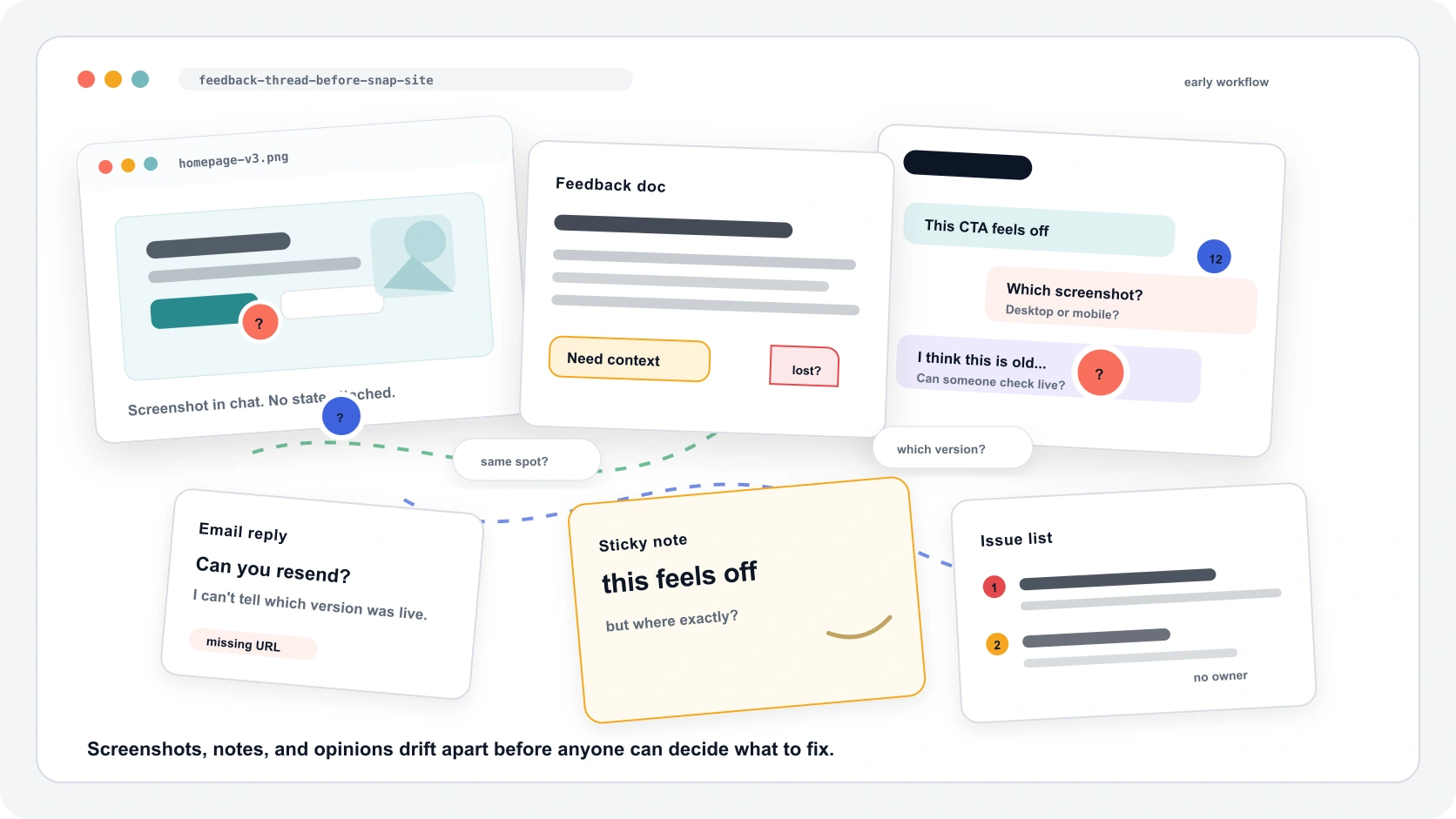
Someone spots a confusing CTA. They screenshot it, share it with the team, and type “this feels off.” By the time the designer sees the note, the context is buried under other updates, two people have replied with different screenshots, and nobody remembers which version was live.
The insight was right. But the evidence — the page state, the viewport, the exact spot on the screen — was lost before the conversation could happen.
The insight
A CTA problem is only clear when you can see the CTA. Mobile spacing only matters at mobile width. Contrast only fails on the actual background color.
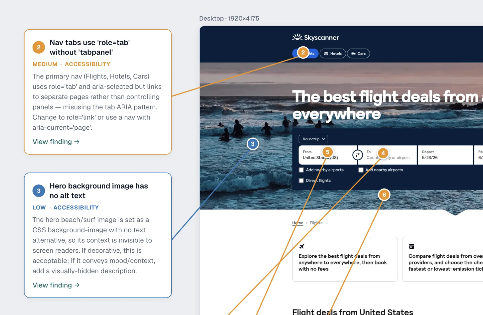
When evidence is attached to the captured page — not floating in a separate doc — teams skip the “which version are we looking at?” phase and go straight to “what should we fix first?”
How it works
Paste a URL, choose the device view, and add a short instruction if a menu, modal, or pricing toggle needs to be visible.
Snap Site captures the screen and pins usability, accessibility, and visual hierarchy issues where they happen.
Save the audit, share it with the team, export a report, or bring the evidence into Figma beside redesign explorations.
Where it runs
Snap Site is mainly a web tool — paste a URL and get the audit in your browser. If you live in Figma, install the plugin and a mini version of the same product runs on the canvas, on the same plan.
Paste a URL and get a visual audit you can save, share, and review with your team. The full Snap Site experience.
Open the web appA mini version of Snap Site that runs on a Figma canvas. Same audits, same plan — just where your design work already lives.
Open in FigmaWho made this
Snap Site was created by Dhwani Khara — a UX designer — at DesignRight, in partnership with CyberSky.
After years of watching good UX insights evaporate in screenshot threads and “see attached” feedback docs, the question became simple: what if the review just lived on the screen?
Snap Site is a small, opinionated tool built for people who review websites for a living. It is not trying to be a design tool, a project manager, or an analytics platform. It does one thing — turns a page into an audit — and it does it well.