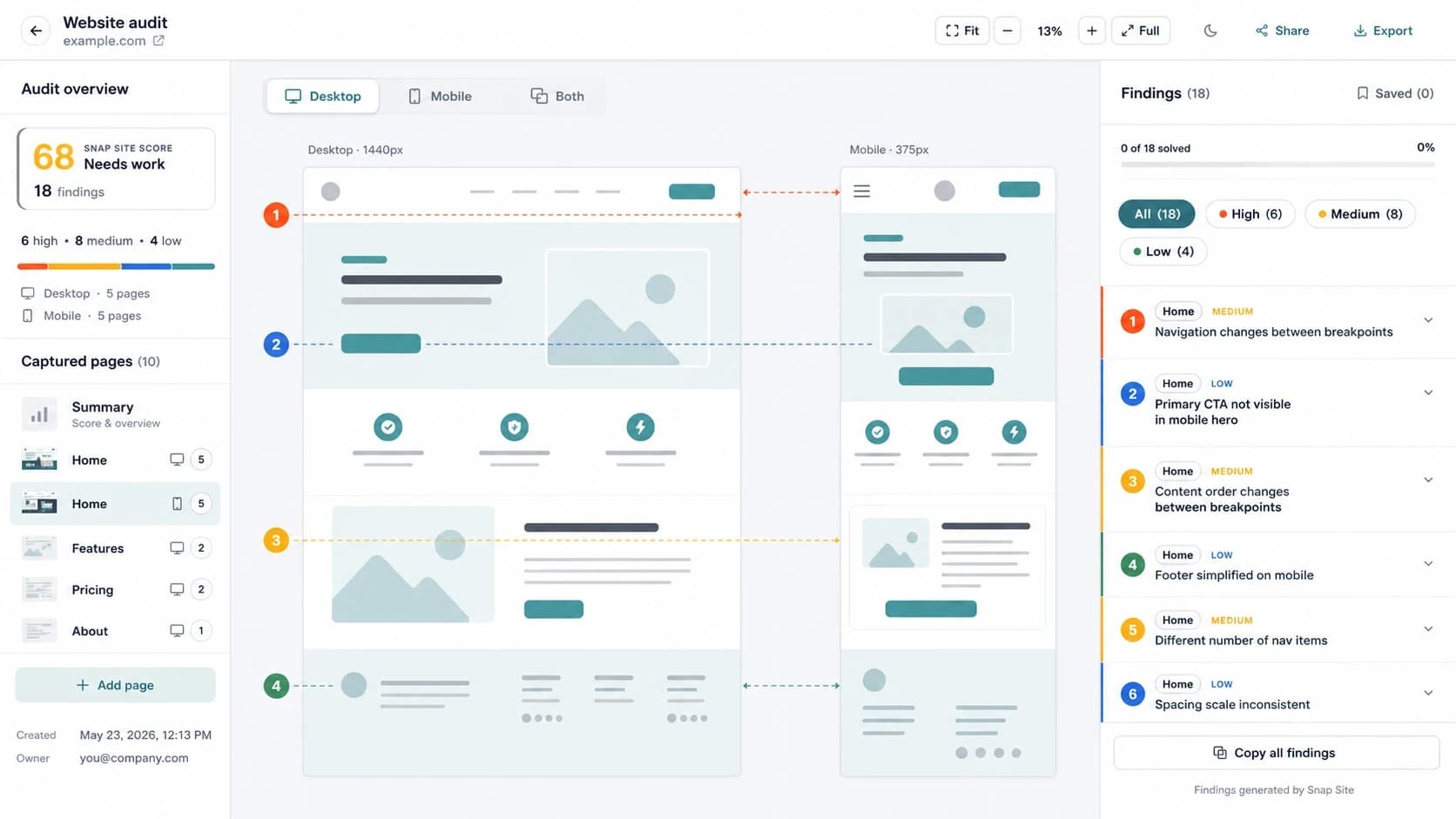
"The site is responsive" usually just means nothing breaks at phone width. Whether the page still works at phone width — whether someone arriving on a phone can still tell what this is and act on it — is a different question, and it's the one that matters. These are the seven comparisons we make when desktop and mobile captures are sitting side by side.
Why the same page fails differently
A mobile layout isn't a squeezed desktop layout; it's a different set of trade-offs. Hover is gone, so anything revealed on hover is gone with it. The fold rises, so what sat comfortably on the first desktop screen is now three swipes down. Fingers are blunter than cursors. Columns become stacks — and the stacking order is a decision somebody made, sometimes by accident.
1. Find the primary button
Locate the main CTA on the desktop capture, then find it on mobile. Is it on the first screen? Is it still the most prominent thing there? Can a thumb comfortably reach it?
The usual suspects: stacked hero content pushing it below the fold, sticky bars sitting on top of it, buttons that lose their visual weight when the layout collapses. If the homepage has one job, this is the check that tests it.
2. Open the hamburger
Desktop navs communicate; hamburgers hide. Maybe that trade is fine for your site — but open the menu in the capture and actually look. Are the links the same set as desktop? Did pricing quietly disappear? Did the dropdown structure survive, or flatten into fifteen links in no order?
Check the other direction too. Footer links that are easy to reach on desktop sometimes end up buried under lazy-loaded sections on mobile.
3. Try to compare two plans
Pricing tables exist for horizontal comparison, and phones don't have horizontal. Three plan cards stack into a tower, and comparing Pro against Agency now means scrolling up and down while holding one card in memory. Look at what the capture actually shows: can plans be compared at all? Is the recommended plan still visually marked? Did the monthly/annual toggle end up at the top of a stack where the bottom plans can't see it?
4. Fill in the form, mentally
Every form gets worse on mobile — the question is how much worse yours got. Do fields that were harmless on desktop turn fatal on a phone? Are labels still visible once the keyboard is up? Does the email field bring up an email keyboard, or did nobody set the input type? Do error messages render somewhere you can actually see them?
5. Read the stack top to bottom
When two columns become one, something has to go first. Read the mobile capture like a story: is it still what this is → why to believe it → what to do? The classic accident is a desktop layout with the pitch on the left and the signup form on the right, collapsing into a mobile page that asks you to sign up before telling you why you would.
6. Squint at the screenshots
A product screenshot that's persuasive at 1,200 pixels wide often says nothing at 350. If the hero shot shrinks into a smudge, the mobile page is making its argument with one less piece of evidence than the desktop page. Same goes for any text baked into images — it doesn't adapt, it just blurs.
7. Watch what moves
Slow connections make layout shift worse, and phones are where mis-taps hurt most. Look for banners that push content down after render, images with no reserved space, fonts swapping late. And give cookie banners their own check: a nuisance at the edge of a desktop screen, a third of the viewport on a phone — often sitting directly on top of the CTA from check number one.
How to actually run this
Capture both sizes of the same page at the same moment, put them side by side, walk the seven checks, and write each finding against the exact spot on the capture. When Snap Site audits a page on desktop and mobile in one run, the captures land in the same workspace with findings pinned per screen size — one credit per page per size, and the side-by-side comes built in. However you run it, aim for the same output: per-viewport findings someone can point at in a meeting, instead of a debate about whether the site "feels fine on mobile".