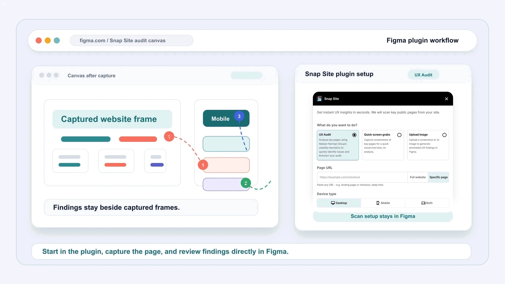
Every heuristic audit we ran before building the plugin went the same way: live site in one tab, Figma in another, a screenshot tool in a third. Half the session went to cropping, pasting, and naming frames. The critique — the actual work — got whatever energy was left.
This guide covers both halves of fixing that: what a heuristic audit should actually look at, and how to run the whole thing on a Figma canvas without the copy-paste tax.
What a heuristic audit is, in one paragraph
You review an interface against established usability principles instead of testing it with users. The standard set is Nielsen Norman Group's ten heuristics — visibility of system status, match with the real world, user control, consistency, error prevention, recognition over recall, flexibility, minimalist design, error recovery, and help. An experienced reviewer with a decent checklist can find most of a page's usability issues in an afternoon, no participants needed.
The known weakness is subjectivity — two reviewers will weight things differently. The fix is to tie every finding to visible evidence and give it a severity, so disagreements are about priorities rather than about what was seen.
Why do it in Figma at all
Because that's where the design conversation already lives. Findings on the canvas sit next to the explorations they're supposed to inform. The annotation tools are ones designers already know. And when the redesign starts, the evidence is one frame away instead of buried in a PDF someone has to keep reopening.
The annoying part was always getting the live site onto the canvas in a reviewable state. That's the part worth automating.
Step 1: Capture the real page
Audit the page as users meet it, not the design-system version of it. In the Snap Site plugin: paste the URL, pick desktop, mobile, or both, and the live page lands on your canvas as full-length screenshots in organized frames.
Live pages carry things mockups never show — cookie banners, promo bars, half-loaded embeds. In our experience that's exactly where heuristic violations cluster, because nobody designed those states on purpose.
If the page needs to be in a particular state first — menu open, pricing toggle on annual — describe that in plain language when you set up the run, and the AI assistance handles the clicks before capturing.
Step 2: One lens per pass
The classic mistake is reading the page top to bottom once and writing down everything that feels off. You catch the loud problems and miss the quiet ones. Make separate passes instead:
- Heuristics — walk the ten principles deliberately. Where does the page hide system status? Where does it use words users don't?
- Accessibility — contrast, text alternatives, focus visibility, touch-target size. WCAG 2.2 A and AA is the practical checklist.
- Hierarchy — does visual weight match importance? Squint at the frame.
- Clarity — headline specificity, label predictability, CTA verbs.
- Responsive — put the desktop and mobile frames side by side and note where the page fails differently by size.
The plugin's AI pass covers the same families and drafts findings pinned to the exact spot they describe, tagged high, medium, or low. Treat it like a first reviewer whose notes you're expected to edit. It beats you on coverage; you beat it on context. Both things are true.
Step 3: Findings that point at pixels
A finding that can't point at evidence is an opinion. Keep each note attached to the element it's about, and give it a shape: the pattern, the evidence, a direction.
"Recognition over recall — comparing plans means memorizing the previous card because the rows don't line up — align the feature rows" survives a triage meeting. "Pricing is confusing" doesn't.
And be honest with severity. If everything is marked high, nothing is.
Step 4: Let the audit live on
After the passes, the canvas is a working artifact, not a snapshot. Edit the AI's notes where your context wins. Add the things only someone who knows the product would catch. Mark findings solved as fixes ship. When you audit the same page again later, the new run sits beside the old one and the delta is your before-and-after.
If your team lives in the browser instead
The same workflow runs without Figma: paste a URL at snapsiteux.com, review the captures with pinned findings in the browser, and share the audit with your team as a link. The plugin and the web app share one account, one credit pool, and one history — start in one, finish in the other. Canvas when the audit feeds design work; browser when it feeds a meeting.